

The Portfolio Website How To for Beginners: Web design when you're not a web designer


The importance of good web design cannot be undersold. It's the reason why the internet looks so good and is such a powerful tool for brand building. Web design is all about communicating who you are and when you're building your portfolio website few things are more important. The problem for many of us is that we are not web designers. In the midst of learning the core web development skills, and catching up on new tools, no one wants to add a completely separate discipline to their plate. Yet, we all want to build products that look good. So, what do you do?
You learn how to steal like an artist.
In building my portfolio website I knew that whilst the code would present challenges, my biggest stumbling block would be in the design process. So, I distilled the idea of web aesthetics into three core components: Colour Scheme, Design Choices, and Wow Factor. In this blog post, I'm going to outline how I got past the design hurdle whilst creating a portfolio website that feels representative of who I am and the brand I want to build, and how you can do it too.
Hint: Steal.
Step 1: Pick a Colour Scheme
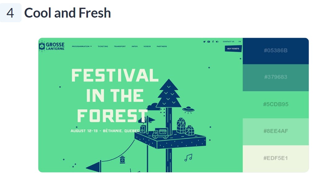
Colour makes you feel. Black is sleek, red is passionate, blue is calming. The quickest way to communicate who you are online is to use colour. However, knowing what colours look good together isn't as easy as picking your favourite colours and calling it a day. So what do we do? We Google "Great website colour schemes". After going through a few web posts, I found this fantastic list of 50 website colour schemes: https://visme.co/blog/website-color-schemes. The best thing about this list is it shows each colour in the colour palette, as well as how these colours look and interact on a website landing page. Additionally, it provides a blurb that describes the type of mood each palette inspires. This approach helps you create design guard rails for yourself. Regardless of what elements you choose to put on your webpage, the colours that you pick for these elements are guaranteed to look good together.
Below is an example colour palette you would find on this site.
Takeaway: Steal a colour scheme that speaks to you.
Step 2: Make some design choices
This step is all about re-enforcing the story you've begun with your colour scheme. This involves picking your fonts, and your layout. The easiest way to do this is to go back to Google and take a look at Portfolio website designs. For this step, I looked through multiple web pages. Bookmarking the sites I liked until I had a list of about 20 or so sites. Afterward, I went back to each site and assessed what it was that I found striking about each page.
Font
I made a list of fonts I like on each page (pro tip: If you open up developer tools you can find the font names for any element on a website) and based on this I decided on two fonts for my website - one for headings, and another for paragraphs.
Layout
Similar to my process for fonts, I made a list of sites with layouts I liked. From this list, I chose a layout to base my website design on. In thinking about my layout choice, the key consideration for me was shapes and curves. Did I want my site to feel geometric, or continuous? Was I attracted to straight lines or swirls and curls? How many images, and what type of images did I want to use? I leaned into what I liked and what felt honest to my tastes.
Takeaway: Steal fonts, steal layouts, but steal things that speak to you.
Step 3: Adding some much-needed Wow Factor
Long gone are the days when sites were just static chunks of text on a page. In 2023, any site you build needs to make use of animation. Whether that's an image carousel, scroll animation or something more advanced depends on you and your programming skill level. How do we get started? You guessed it. Google. Here I suggest you look up award-winning websites. These sites more often than not have a wide array of various animations used on any one page. If you're a beginner, find an animation you like, that also doesn't look too complex. Focus on animations that alter a single line of text or one element on the page, for example, a blob animation that expands and contracts. Feel free to look for example code online for this. Great sources for code snippets are Codepen ( https://codepen.io/ ) and Youtube tutorials. Not only will it speed up the development process, but reading other people's code is also a great way to improve your skills. If you're more advanced in your web development journey, challenge yourself to emulate an animation without the use of online resources.
Takeaway: Steal an animation or two, but only if it speaks to you.
Lesson of the story: STEAL. This guide might not give you a full-fledged step-by-step of what your portfolio website will look like by the end, but it does give you key starting points. Depending on how creative, or courageous you are, you can create something completely new, drawing on the elements you enjoyed from other websites or you can focus on your web development skills and re-create the elements that were most striking to you. Either way, steal, but only if it speaks to you because the web design of your portfolio site, should speak for you.
If you want to check out the portfolio website I built for myself using this 3-step design process click here.